“One of the biggest assets and also the easiest way to make consumers vibrate – or alienate a brand – is through color.” June Mcleod, author of Color Psychology Today
In packaging design, too, color is also a special factor that makes the success of a packaging design.
Packaging design is the combination of materials, structure, presentation, images, colors and other elements that create visual appeal for the purpose of communicating the goals and marketing strategy of a company. brand or product where color is the “golden key” that determines the success of that design.
If used well, color will be an important element of any branding toolkit. Most famous brands have used color to indirectly influence purchasing decisions and change consumers’ perceptions. However, the colors of the packaging designs of different industries have different uses.
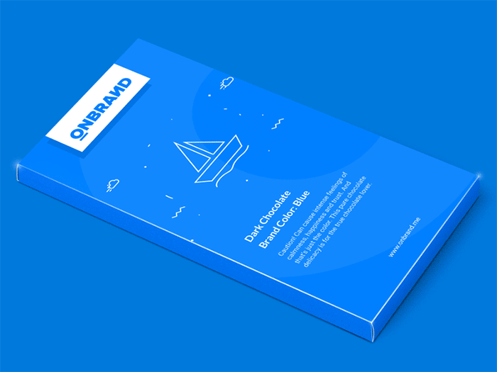
1. Packaging using blue color – Building trust for consumers
In many studies on the psychological effects of blue, many color researchers have found that blue conveys a message of trust. That is why blue is often used and most people like blue.
Blue is the color of trust, peace, order and loyalty (original). Blue evokes calmness and a sense of serenity. Therefore, most packaging products and paper boxes in the medical field often use blue as the main color, because blue brings a feeling of trust and serenity.
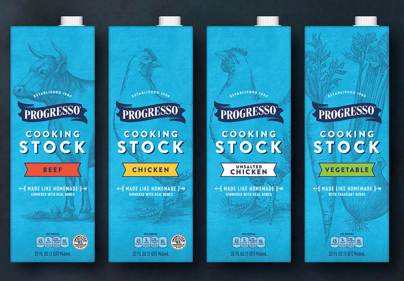
This is a much-needed emotion for the field. Besides, in the medical field, the types of packaging and paper boxes we often see have a combination of blue and white to create a feeling of purity, cleanliness and trustworthiness.
Because blue is a color that symbolizes purity, the packaging of pure drinking water products also often uses this color to represent this aspect.
Although blue is considered a great color, it should never be used for any kind of packaging related to the food sector. According to many studies, blue reduces cravings. Therefore, dieters often use blue plates to reduce eating and maintain weight.
Evolutionary theory suggests that blue is the color associated with poison, with the exception of blueberries and plums. Therefore, in the design of packaging, paper boxes … of the food sector, the main unwritten law is never to use blue in packaging design for food-related products.
2. Packaging uses red color – Create excitement, stimulation
Red stimulates the pituitary gland, increasing the heart rate and causing people to breathe faster. The body’s visceral response to red exposure causes the body’s reaction to become aggressive and powerful. Therefore, in the design of food packaging, red is often used to stimulate appetite. Red brings a sense of passion, is a color often applied in food packaging design.
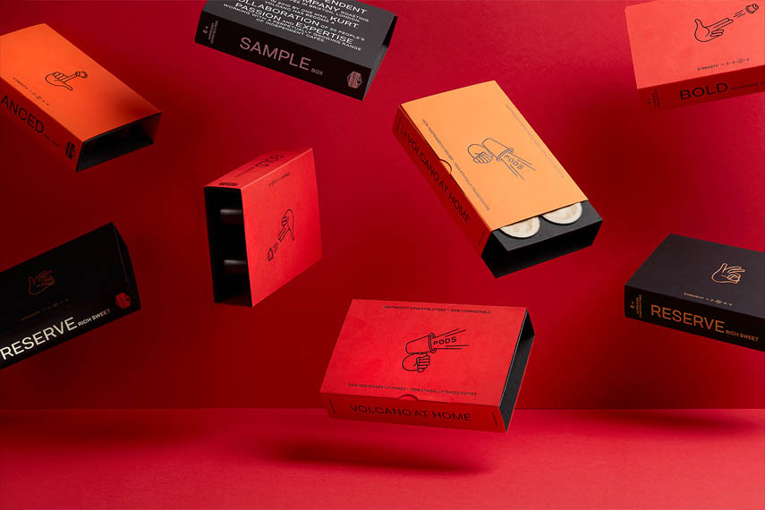
In Eastern culture, red is considered a lucky color, expressing the spirit of determination and determination to win.
However, in the West, red also symbolizes blood, war, pain and even threat. Therefore, it is necessary to be careful in using red to take advantage and avoid being overly offensive.
3. Orange packaging – Fun, stimulating action
Orange is a warm color. Therefore, when used in packaging designs, paper boxes need to be considered so that this color gamut does not overwhelm the actual messages of the advertisement. Orange creates a feeling of joy and stimulates action.
Orange mixed between red and yellow creates a sense of collective and is often associated with childhood. Therefore, in the design of packaging and paper boxes for children’s products, most designers often use orange as the main color.
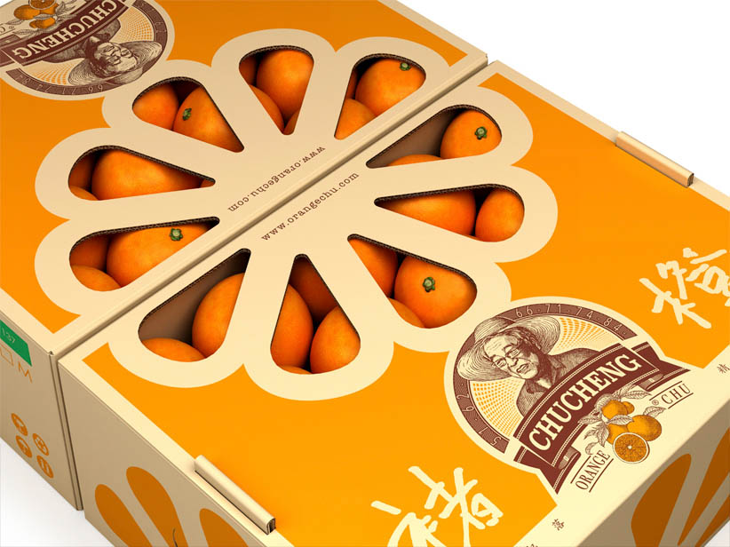
Besides, in many studies, light orange color is attractive to the high-end market, suitable for medical services, hotels and beauty care institutions for women.
Meanwhile, the original dark orange color conveys a message for limited-time products. This color shows urgency, makes the message more noticeable, and takes action. If the product belongs to the low-priced segment, the original orange color is also a color worth considering to use as the main color in packaging and paper box design.
With beverage products, orange is also a popular color, because orange brings a sense of joy and stimulates the act of opening the drink.
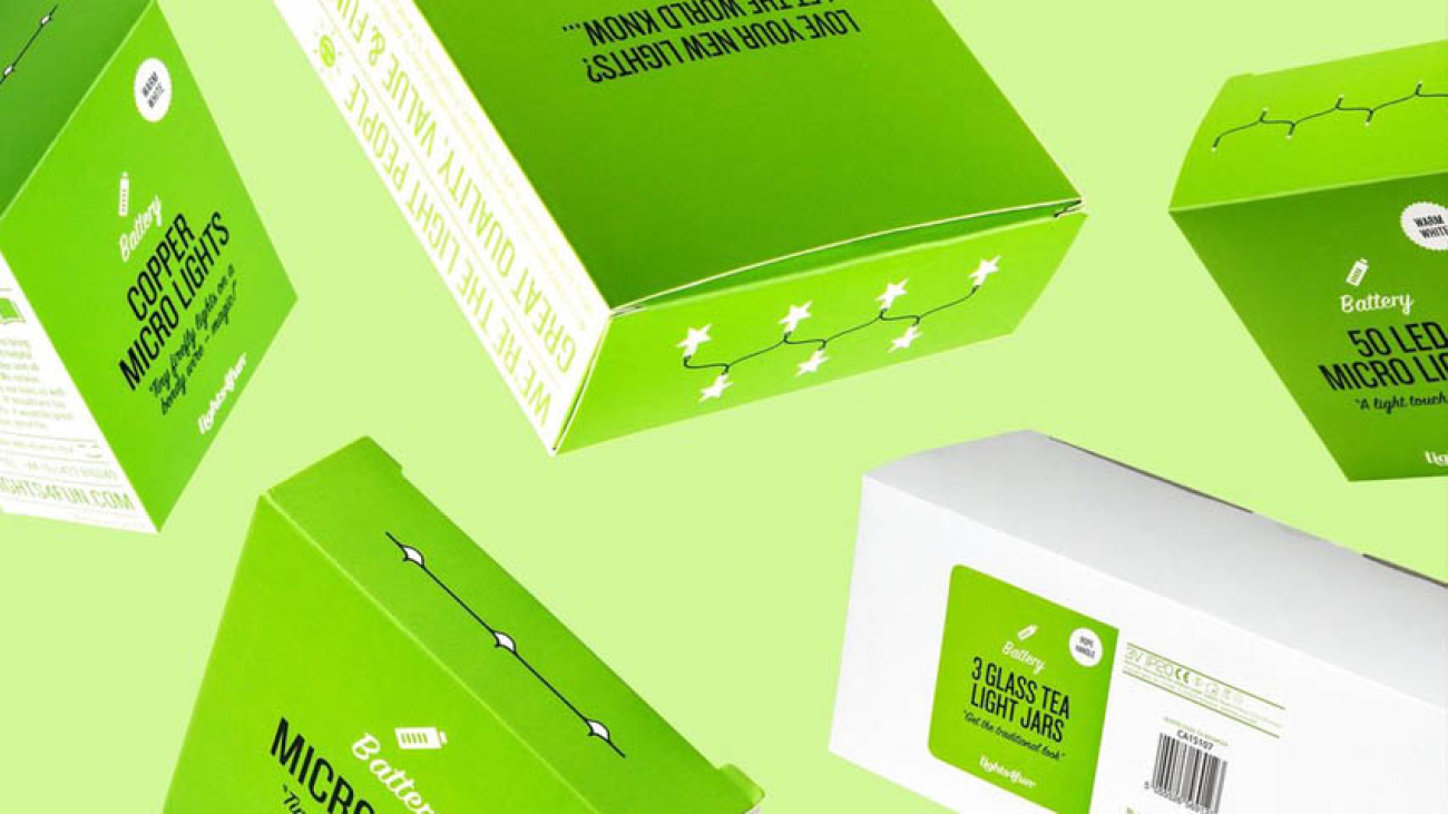
4. Green packaging – Symbolizes health, freshness and calmness
Green is the ideal color for environmental products and outdoor products. The color green is essentially a symbol for the color of nature. Therefore, green connotes health, freshness and calmness. Dark colors also have different meanings.
Because of the symbolism of natural colors, green is often used as the main color for the packaging of products associated with nature, expressing purity. In particular, bottled water products often use this color.

Besides, in addition to the obvious outdoor hint, green is also a color that can improve creativity.
A study on the “green effect” showed that participants had more creative ideas when presented with a flash of green than other colors. Expressing creative product packaging, blue is also a good choice.
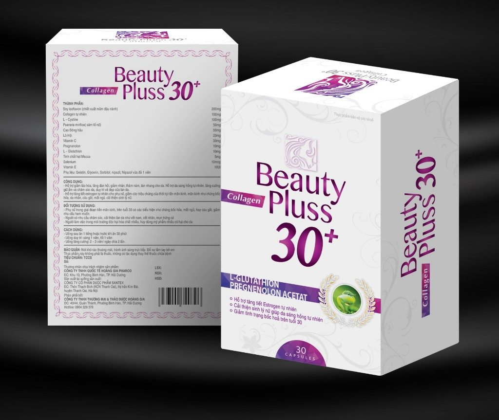
5. Purple, black, white, pink packaging attracts the beauty product world
Although many retailers still prefer to present their products as a solution that fits both genders. However, for cosmetics manufacturers often target more specific customers such as for men or women.
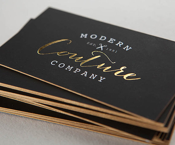
For men’s products such as razors, home appliances, etc., a combination of masculine elements in packaging, paper boxes in colors such as black, gray, brown, square blocks with sharp edges. is the key to creating a superior sales rate.
On the contrary, for products manufactured to target female customers, if the packaging or paper box is designed with soft, feminine textures, the packaging is evaluated as aesthetically pleasing and practical. high bow.
This type of packaging designed in this style both shows the characteristics of the product and is popular with women. In particular, the favorite colors of the sisters are white, purple, pink or blue.
A good packaging must attract a good feeling of the consumer about the product through looking, examining and touching the product.
As a professional packaging and paper box designer, you cannot ignore any of the factors that make up the success of a packaging product. Therefore, choosing the right color for the product is also a factor that cannot be ignored.
Before starting to design packaging products, paper boxes, designers need to carefully understand the needs and target customers. Determining what are the needs and wants of consumers for a product and for product packaging will make orientation and design faster and more efficient.
(Source: Collector)